
Enquiry: how does translating an image through different grid-based systems change the way its visual information is represented and perceived?I started with digital systems because they were the closest to the cross-stitch: each one breaks the fence into repeated units, whether pixels, halftone dots, characters or spreadsheet cells. In a digital grid the translation follows rules, so I could change one variable at a time and see what survived. I began by reducing resolution, then changed the visual treatment, then changed the unit itself from a pixel to a character, and finally returned to a cell-based grid in a spreadsheet, where I could remove parts of the structure systematically. Throughout, I read these through Krauss (1979), who describes the grid as an ordered, flat surface standing in for the real world, and through Jacquard’s punched cards, where each unit is an instruction that builds the image.
01- Pixelated images [10 versions]
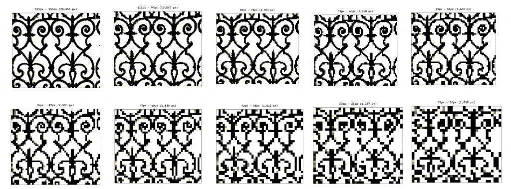
Click for PDF with enlarged images (created using https://pixelartvillage.com)
| FIELD | NOTES |
|---|---|
| What I changed | Reduced the image resolution across 10 versions, from 28k to 1 pixel. |
| What I kept consistent | The original fence photograph and overall composition. |
| What happened | Fine details disappeared as resolution decreased, but the overall fence remained recognisable in some low-resolution versions. |
| What it communicates | An image can retain its identity even when much of its visual information is lost. |
| My response | Reducing the resolution made the relationship between detail and recognition easier to observe. |
| What I learnt | Recognition depends on more than individual pixels; larger shapes and contrasts can carry meaning. |
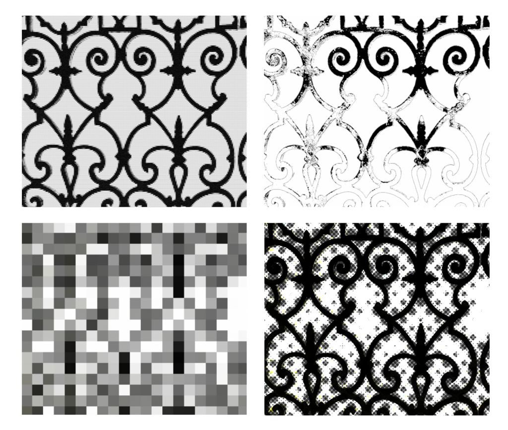
02- Abstract Tone Mapping [4 versions]
| FIELD | NOTES |
|---|---|
| What I changed | Applied extreme blur, tiny grids, different halftone circle sizes and a worn-out effect. |
| What I kept consistent | The original photograph and its subject. |
| What happened | The fence shifted between soft, textured, patterned and degraded appearances. |
| What it communicates | Different visual treatments prioritise different information: tone, texture, contrast or structure. |
| My response | Experimenting with the effects revealed how differently the same photograph could be interpreted. |
| What I learnt | Translation is not neutral; the method determines which visual qualities become prominent. |
03- ASCII Art [8 versions]
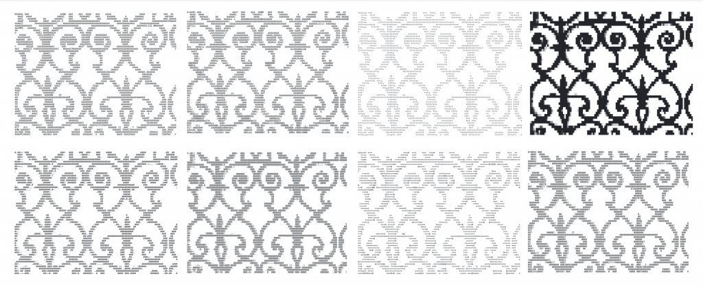
Click for PDF with enlarged images (created using https://www.asciiart.eu/image-to-ascii)
| FIELD | NOTES |
|---|---|
| What I changed | Used different character sets, including letters, numbers, arrows, symbols, mathematical characters and Code Page 437. |
| What I kept consistent | The source image and approximate output scale. |
| What happened | Code Page 437 produced the clearest result; other sets changed the density, contrast and legibility of the fence. |
| What it communicates | The characters used to construct an image influence what information remains visible. |
| My response | Changing the character set allowed me to compare different visual results without changing the overall scale. |
| What I learnt | The grid’s units matter as much as its size: character shape and density affect recognition. |
05- Excel Spreadsheet [19 versions]
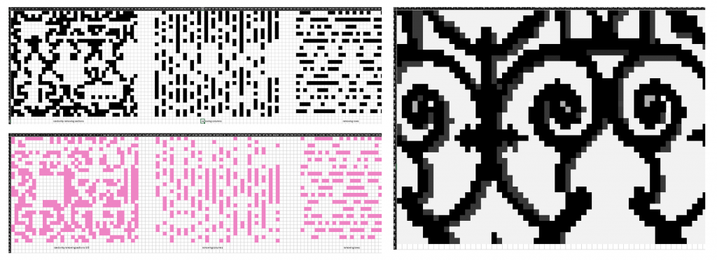
| FIELD | NOTES |
|---|---|
| What I changed | Created pixelated and inverted versions, then removed random cells, alternate columns, alternate rows, or both. Repeated the tests on a closer, more detailed crop with shading. |
| What I kept consistent | The fence photograph within each comparison and the spreadsheet’s cell-based grid. |
| What happened | Some fence details disappeared, but the swirls remained visible in several disrupted versions. Removing rows and columns made the image blurrier and more abstract. |
| What it communicates | A grid can lose parts of its structure without immediately losing the overall pattern. |
| My response | Systematically deleting cells made it possible to compare different kinds of disruption. |
| What I learnt | Random loss, directional gaps and tonal inversion affect visual information in different ways. |
What this section showed: The method decides what survives. Pixelation kept large shapes and contrast, ASCII kept density, and the spreadsheet showed that a grid can lose a lot of its structure before the pattern fails. The digital grids all degraded the image predictably, so I wanted to see what handwork would change.
Leave a Reply